Steal my 20+ UX Writing Tips for Better Content Design
Copywriting for team-of-one product designers
When I worked for startups, I wished I had these tips. Instead, I was trying to produce verbose sentences that were grammatically correct.
I understand the unique challenges when working as a solo, team-of-one designer and wearing multiple hats — including content design.
This article is a written version of my YouTube video with the same title, which you can watch by clicking here.
Despite no longer working for startups and having dedicated content designers on my team, I still visit these tips from time to time.
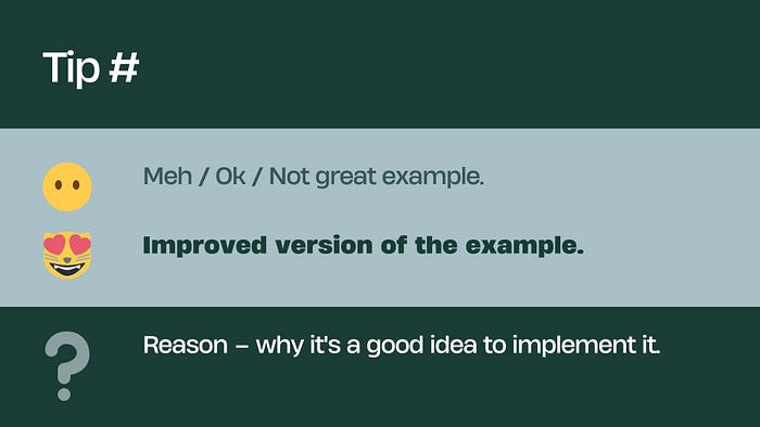
Tip #1 — Keep it simple
OK: “The coloration of the clickable button is blue.”
Better: “The button is blue.”
Why: A good sentence uses simple language that is easy to understand.
Tip #2 — Use active voice
OK: “Your account has been deleted by our system.”
Better: “We deleted your account.”
Why: Active voice is direct and easy to understand, which improves clarity.
Tip #3 — Avoid jargon
OK: “The JSON file was corrupted.”
Better: “There was a problem with the file.”
Why: Not all users will understand technical terms. It’s best to keep the language clear and simple.
Tip #4 — Be concise
OK: “In order to proceed with the process, you are required to press the button marked as ‘Continue’.”
Better: “Press ‘Continue’ to proceed.”
Why: Shorter, to-the-point sentences reduce cognitive load and increase understanding.
Tip #5 — Use personal language
OK: “Users should update their profiles.”
Better: “Update your profile.”
Why: Speaking directly to the user creates a more engaging and personal experience.
Tip #6 — Align with the brand tone
OK: “Hey there! Wanna see your account details?” (for a professional business application)
Better: “View your account details.”
Why: The writing should match the brand’s tone to provide a consistent user experience.
Tip #7 — Provide clear error messages
Not great: “Error 404.”
Better: “We can’t find the page you’re looking for.”
Why: Clear error messages help users understand what went wrong and what they can do next. Add an example, “Did you mean xyz page”?
Tip #8 — Use positive language
OK: “Don’t forget to save your work.”
Better: “Remember to save your work.”
Why: Positive language is more engaging and user-friendly.
Tip #9 — Avoid double negatives
OK: “Do not uncheck this box if you don’t want to avoid unsubscribing.”
Better: “Check this box to keep your subscription.”
Why: Double negatives can confuse users, making it harder to understand the action.
Tip #10 — Prioritize readability
Not great: “Savechanges” or “SAVE ALL CHANGES” or “Save Changes.”
Better: “Save changes”
Why: Proper spacing and capitalization improve readability and comprehension.
Tip #11 — Give clear instructions
OK: “Go ahead.”
Better: “Click ‘Next’ to continue.”
Why: Specific instructions help guide the user’s actions.
Tip #12 — Use numerals for numbers
OK: “Your package will arrive in two days.” and “You have thirty minutes to activate your account.”
Better: “Your package will arrive in 2 days.” and “You have 30 minutes to activate your account.”
Why: Numerals stand out better and are easier to scan than spelled-out numbers. Also, think about all the non-native speakers who might use the product.
Tip #13 — Use verbs to start action button labels
OK: “Agreement acceptance”
Better: “Accept agreement”
Why: Action words at the beginning of button labels make it clear what will happen when the user clicks.
Tip #14 — Use descriptive link text
OK: “Click here.”
Better: “Learn more about our privacy policy.”
Why: Descriptive link text improves accessibility and helps set appropriate expectations about what users will find when they click.
Tip #15 — Write for your audience
Not great: “Please submit your query.” (for a children’s app)
Better: “Ask us anything!”
Why: Knowing your audience helps you write in a way that best communicates with them.
Tip #16 — Use consistent terminology
OK: Using “Cart”, “Basket”, and “Bag” interchangeably on an e-commerce site.
Better: Consistently using “Cart” throughout the site.
Why: Consistent terminology enhances clarity and prevents confusion.
Tip #17 — Explain acronyms and abbreviations
OK: “Our CDN improves site performance.”
Better: “Our Content Delivery Network (CDN) improves site performance.”
Why: Not all users will be familiar with specific acronyms or abbreviations, so it’s best to explain them.
Tip #18 — Provide context for data
OK: “You’ve earned 1500 points.”
Better: “You earned 1500 points — enough for a $15 voucher.”
Why: Providing context helps users understand the relevance or value of the information.
Tip #19 — Communicate time frames accurately
OK: “We’ll get back to you soon.”
Better: “We’ll respond within 24 hours.”
Why: Providing specific time frames sets realistic expectations for the user.
Tip #20 — Use simple verb tense
OK: “The money has been sent.”
Better: “Money sent.”
Why: Using simple verb tense (e.g. past simple) makes sentences easier to comprehend.
Tip #21 — Test your content
OK: “Continue with the task.”
Better: After testing, you may find that “Keep going” performs better.
Why: Testing different phrases helps identify which best drives user engagement.
These are my 20+1 tips for designers who also write copy because no one else on the team would.


