Must-know golden rules for icon design in UI & web design

The basics of effective icon design are clear. Icons need to be consistent, legible, and clear so that users can easily understand and recognize them.
Iconography is an important part of user interface design. It’s a visual language that represents actions and content, as well as shows the meaning behind functionality.
My tips to help you design better icons
Tip #1 — Design icons using a grid
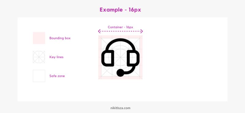
Great icons are always made using grids.
You need to define your bounding box and the safe zone within and set a few key lines.
Use the grid as a template to make your icons’ proportions uniform. Don’t mix size, rather stick to the same size e.g.24px.
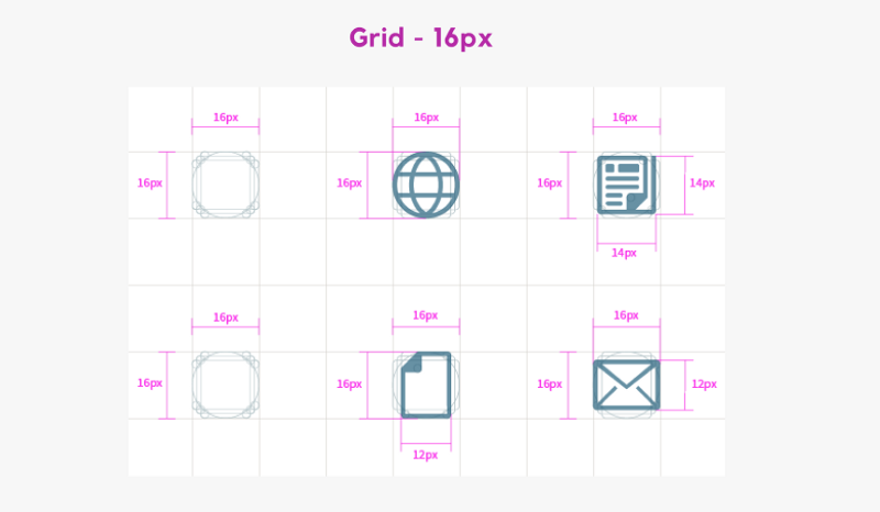
When making icons using a grid, keep these shapes in mind and recreate sized directly (e.g. 16 px grid):
for a square shape, use 14px by 14px
for a circle, use 15px diameter
for a vertical rectangle, use 12px by 16px
for a horizontal rectangle, use 16px by 12px.

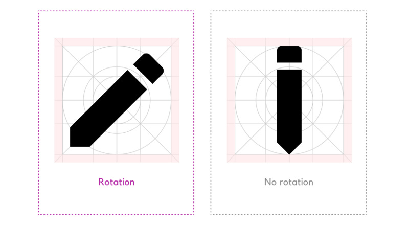
If the icon is narrow, don’t be afraid of rotating it so it fills the container/grid. Try to use the whole container. Your icon will look more balanced.
Tip #2 — Use consistent design
Use the same line width/stroke width, corner radius, and fill style to make your icons unified, so that they look like they come from the same icon family. Eg. thickness is 2px, corner radius is 5px.
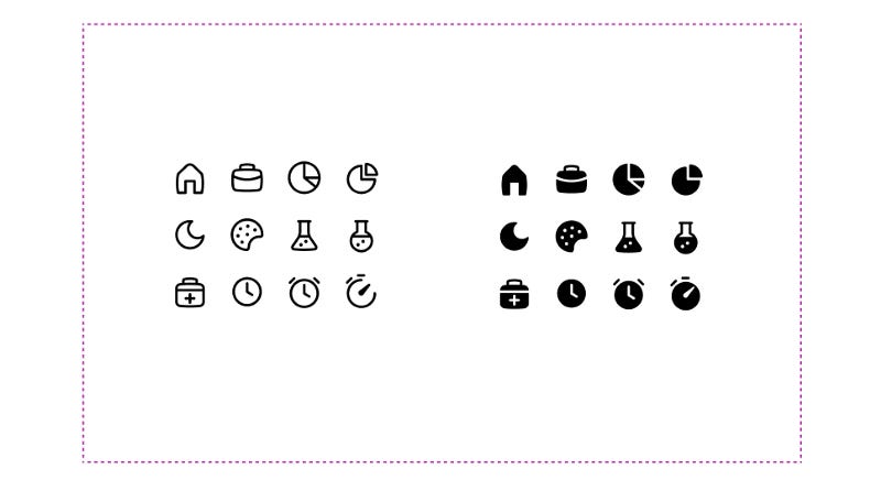
Should you mix filled and outlined styles?
It depends. Usually, you shouldn’t.
However, if you want to represent a different state of the icon, feel free to mix them.
But be aware of all of your icons need to have a nice filled match as well.

Part of becoming a great designer is learning and knowing when to break the rules and when to follow them.
Tip #3 — Use a minimalistic style
Less is more.
Try to avoid intrinsic icon design on the web. Use only details that are important to make the icon easy to recognize and be understood.
All icons in the set should use the same colour combinations. Choose your colours, add them to swatches, and attempt to stick to them. Sure, you’ll have to make exceptions and add more colours here and there, but to make something aesthetic you only need a few colours to colour the entire icon set.
Tip #4 — Use similar spacing
Use the same spacing between icon elements e.g. 3px. It will unify and harmonize your icons.
Tip #5 — Use optical correction
Sometimes when you have different shapes nested in each other, your icon can look off-balance visually. If that’s the case, align the elements based on the optical centre to balance them.
The YouTube logomark is a perfect example of it, where the triangle is not exactly in the centre.
Summary
Prioritize icon recognition over cohesiveness.
Don’t forget, clarity and recognition distinguish a great icon from an ok icon. Never sacrifice clarity. Icons should be aesthetic of course, however, icons should first convey the correct message, and only then should look attractive.
One last bit…
Creating unified icon sets is far more difficult than it appears. Because you need to pay attention to the smallest details, and possibly redesign the sets several times.
So, if you’re looking for handy resources, I have a few suggestions, so make sure to check them out:
This article is a written interpretation of my How to design better icons YouTube video.
If you liked this post, here are 3 things you can do to support me:
👏 Give the article a clap.
🤞Follow me for upcoming articles: email sub or membership sub.
💌 Sign up for my free newsletter (receive freebies) and YouTube channel to learn UX & UI design and level up your career.
Of course, you can always reach out to me on Twitter to continue the conversation.


